.png)
Uncovering $620K: How a Simple Dashboard Revealed Untapped Revenue Potential for a Roofing Company
- Christian Steinert

- Feb 25
- 8 min read
Learn how Steinert Analytics maximized the value of a roofing company's JobNimbus CRM data
Data Infrastructure is Taken For Granted
On LinkedIn, I talk a lot about prioritizing data foundations over fancy tech. From the seasoned data architects I know, this is not a controversial take. In fact, it’s a viewpoint that is commonly stated by data experts across the globe.
However, a somewhat unique opinion I hold is that there is not enough data content that talks about companies in level zero of the AI Maturity Model. The AI Maturity Model is explained in detail throughout the book From Data to Profit by
Lots of the data strategy content I see on LinkedIn completely skips small companies with far less mature infrastructure, processes and culture. In my opinion, a more mature digital infrastructure set-up is taken for granted by analytics professionals. Analytics people default to data infrastructure as valuable without question.
Companies in level zero are using digital technology in their day to day workflows (think a CRM). However, the readiness for data analytics and AI using their own data is not there. Poor processes lead to poor data generation. In this issue, I want to walk through our experiences strategically driving data analytics for the potential bottom line improvement of a level zero roofing company.

I made a post about this story that went viral on LinkedIn a few weeks ago. See below.

Roofing Company Challenge
Being a 3 year old roofing company, our client experienced huge growth. $0 to $10 million annual revenue in just 3 years is no small feat in the residential roofing industry. The company has prided itself on a unique culture of confidence, reliability and consistency with a core focus on sales, teamwork and work ethic. Pairing this culture with a unique approach to media marketing, they grew faster than their operational processes could keep up.
Their digital infrastructure was already running when we started engaging with them. However, after doing a data audit there were many gaps in their financial, sales CRM and marketing software data.
Poor integration from their digital marketing leads to the CRM, improper creation of jobs in the CRM and inconsistent field values all made it difficult for tracking. Furthermore, their QuickBooks Online accounting software was in a complete overhaul to move from accrual to cash-based accounting.
Since all source systems were immature, we began by focusing on their sales process, as decided on after multiple prioritization meetings with their CEO.
Constructing a Business Data Model
We kicked off the engagement by conducting a business data model (BDM) session on our roofing client’s sales process. This allowed us to understand all of the core elements and steps involved with their customer journey from the beginning of the sale, all the way to the end of the job.
It gave them alignment across departments on how a customer moves through their sales funnel and internal language is defined. We clarified answers to critical process questions such as:
When does a lead turn into an opportunity?
When does an opportunity turn into a job?
When is a job considered closed won?
These are all questions they never truly defined until this exercise. You can read more about the full value this exercise provided them in the They’re Counting On You blog by Zack Ober (Available here).
Source System Re-Architecture
Once the BDM was completed, we knew we had high level alignment across the business about their sales process. What followed was a trip to Salt Lake City, Utah where we met with a partner at JobNimbus HQ (their roofing CRM) to re-architect the system’s workflows. We aligned the entire company process with correct stages and statuses in their sales, production, billing and work order workflows.
Once completed and implemented for 3 weeks, we had semi-quality data to begin working with. I say semi-quality because CRM culture adoption has still been a bit of a challenge for some members of their sales team.
After a series of consults, we determined that the highest value solution was a dashboard able to show how long a job is taking to move through the entire company process by stage, status, job type, and sales rep. By having this insight, the team could more effectively optimize bottlenecks in their process, thus allowing higher job volumes (leading to more revenue).
Based on issue 29 of The Data Ecosystem by Dylan Anderson, this dashboard is categorized as diagnostic process analytics. The whole purpose is to identify bottlenecks to optimize operational workflows.
Now you might be thinking, why can’t one just visualize this in a native JobNimbus dashboard? The native reports were hard to read and relied on tables to visualize jobs by status and time. These are visually clunky and take more effort than a quick glance - something a CEO does not have time for. Furthermore, you could not filter the data respective of a Job moving through the sales, production or billing process boards shown in the user interface.
At this point - data architecture questions began to pop in our heads. Do they need a data warehouse for this? Are they ready for data infrastructure? After a brief (and maybe somewhat obvious) assessment, it was clear this roofing company was nowhere near ready for enterprise data infrastructure.
Besides their CRM, no other source system was generating even semi-quality data. Leveraging a data warehouse and trying to centralize the small amounts of data they had would have been overkill at this maturity.
We confirmed with the CEO to stay lean for this dashboard build, and that we did.
Building the Solution
Our tech stack decision was cost effective, lean, and mean. We exported the JobNimbus operational data from a native report / dashboard into a CSV. We filtered the data to be on or after the date the company began using the new workflow processes we established while in Utah. This ensured the highest possible quality data available to us.
Once the CSV was loaded into a Google Sheet, we did some basic transformations to reorder columns and align field value data types. We then connected this transformed Google Sheet to Looker Studio’s free tier using the native Google Sheets connector.
Using some basic CASE statements in Looker Studio, we were able to correlate all of the JobNimbus job statuses to the sales, production, and billing workflows respectively (called “Boards”).
As you can see, this solution is about as basic as it gets from the context of a data tech stack. The real unlock of this dashboard was its emphasis on visual best practices and showcasing Job ID workflow data better than any native reporting found in JobNimbus.
Since the company’s technology budget was tight and digitally immature, implementing the latest and greatest data tools would have been a complete waste. Instead, we delivered something that was a quick win at a low cost that doesn’t waste time or money.
The only drawback to this solution is that we have to charge them maintenance fees to refresh the dashboard every week. Eventually, they will be digitally mature to the point that we can begin integrating all of their data into a data warehouse to automate.
However, for now the fees are a small price to pay for getting immediate value out of their data given the company’s immaturity.
The Valuable Dashboard User Experience
The dashboard’s design combines enriching information with simplicity. It includes two different pages.
The first page, called Job Breakdown, shows average and total days in status by status. Furthermore, it cleanly displays the number of jobs by job type. Details are located in a table tile at the bottom. The table provides additional fields such as job type, sales rep, stage, status and status order. A user also has the ability to filter on a specific Job ID or set of IDs, making specific job analysis quick and easy.
An end user can also filter on specific sales reps or job types.
Please see below.

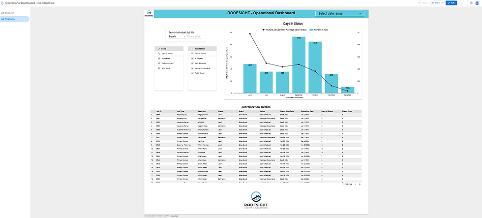
The second page, called Job Time Series, enables a user to see the number of jobs and days in status trended over time. A user can also filter on any workflow Board to make it far easier to analyze jobs in specific stages of the overall company process (sales, production or billing). At the bottom, similar to the first page, is a detailed table view of the data as well (this gives greater detail for the end user’s analysis).
See below.
Reception and Bottom Line Value Breakdown
Overall, the dashboard was well received by the CEO and COO. Their JobNimbus CRM reporting was not as digestible or efficient as this dashboard’s user interface and experience.
Ultimately, by leveraging this dashboard to quickly identify bottlenecks, they will be able to optimize their processes moving forward.
Based on data from September through December 2024, the average time a job took from start to completion was about 33.58 days, ~4 days past our rough estimate industry standard of 30 days.
The majority of these jobs were insurance, not retail. We realize insurance roofing jobs can have wide variability with completion times, thus making it difficult to calculate a true industry average time to completion.
It’s projected these insights could have added an additional $622,404.30 in top line revenue annually. This is equivalent to a ~12% annual job volume increase.
Here’s how the math breaks down:
Current average completion time: 33.58 days
Industry average completion time (our estimated benchmark!): 30 days
Number of jobs completed (paid & closed): 254
Adjustment factor: 30 days / 33.58 days = 0.8936 (approximately)
Jobs completed at industry average pace: 254 jobs / 0.8936 = 284 jobs (approximately)
Calculate the difference in the number of jobs:
Additional jobs possible: 284 jobs - 254 jobs = 30 jobs
Calculate the potential additional revenue:
Average job value: $20,746.81
Potential additional revenue: 30 jobs * $20,746.81 = $622,404.30
Calculate the percentage increase:
Percentage increase = (Additional jobs / Actual jobs) * 100
(30 jobs / 254 jobs) * 100 = 11.81% (approximately)
When looking at that dollar amount and increase, one has to assume they will take action to optimize all uncovered bottlenecks in their processes moving forward.
We did not define thresholds for the number of days a job sits in each status to the next - we left that up to our client’s COO.
Either way, the huge opportunity these insights unlock made this dashboard a massive success for their team and a critical tool for optimizing their roofing company’s efficiency.
Gaps We Encountered
Seasonality: We only had 4 months of data to work with (9/2024 - 12/2024), failing to account for seasonal trends.
Data Quality: September 2024 data was poor quality due to the workflow re-architecture and shift (Lots of jobs sitting on the old workflow processes were shifted to the new in JobNimbus).
This caused a massive uptick in job counts for September, thus forcing us to base the average jobs per month off the last 3 months of the year (October - December).
Furthermore, a lot of these jobs were moved from before September, thus causing a far higher number of jobs and sales into a 4 month period.
Data Quality (again): Due to lots of incomplete jobs in JobNimbus (due to poor data entry and lack of adoption by some sales team members), we had to filter our records to only jobs with a status of paid & closed and a sales amount greater than 0.
Capacity: We are assuming they have the labor and material capacity to handle an uptick in job volume.
Although battling some of these data quality issues wasn’t ideal for 100% accuracy, we’re confident the visual best practices will help our client digest their operations far more efficiently than the tabular visuals displayed in JobNimbus.
In turn, this will help them optimize their entire process going forward to increase their overall job volume and drive more revenue.
If you’re interested in connecting with me, feel free to reach out on LinkedIn.
Otherwise, if your roofing company could benefit from enhanced JobNimbus reporting like this, book a free consultation here.


Comments